Digital Tampering – a possible solution?

Should we allow images used in media to be extensively edited?
From my perspective, absolutely.Creating a perfect image is a key element to making a product or service desirable.
Can it cause problems in society where being constantly subject to seeing these images can affect our perceptions?
Undoubtedly.
In the same way that a percentage of the population are more susceptible to hypnotism or subliminal messaging, we will all be influenced at some level by what we see every day.Should we put disclaimers on images that are edited in magazines, billboards etc….?
Yes, I believe that we should have a something on the images so we know they’ve been retouched.
How can we find a middle ground that doesn’t have ugly distracting banners taking a percentage of the image in the same way cigarette packets have the warning labels on them …. which don’t work. I know friends that bought skull&crossbone cigarettes because they were perceived to be more dangerous (go figure)
I thought of a possible solution:
Rather than obscuring a part of the image with a white warning box, why not put small colour (or greyscale) circles/squares subtly in the corner of the image or page which relates to the editing work that was carried out.It could be ISO standardised so that it’s the same for everyone to use, or alternatively each magazine could have their own key chart shown in the bottom of the MastHead.
For example:
Blue: Colour change (e.g. eyes, clothes, skin)
Red: Blemish Removal
Green: Texture alterations
Yellow: Shape changing (Liquefy/Stretch/Shrink, bigger eyelashes, narrower thighs etc..)
Grey: Added extra elements (CGI, blending other images)Here’s a rough example of how it could look.

Everyone should be happy 🙂
Advertisers keep their perfect images and consumers subconsciously know it’s been enhanced away from reality.So, what’s your opinion on how images should be shown in the media? Edited or warts ‘n all? 🙂
The power of a professional image


I’ve created this post to illustrate how we can’t help transferring our feelings of the quality of an image onto the person or product that’s in the image. And as a direct result this will influence the interest that we have in that person or product.
We can’t escape that engrained part of our nature that, in the first 5 seconds, we will have assessed and judged a subject by it’s appearance and a lot of our following attitude to the person/product will have been decided in that 5 seconds.
During a recent conversation, I was asked whether or not it was worth having a professional picture of themself to use on websites, email, business cards and other marketing materials?
My reaction to that is of course "Yes", but they suggested that existing snapshots from a recent holiday or wedding should suffice?
While the holiday/wedding snapshot may be free, what image will they really be portraying?
Poor Quality? Slapdash? Cheap?….. none of which you want potential clients or contacts to associate when they think of you or your product.If you look at successful people or companies, you’ll see a common trend in that they only have quality images representing either themselves or their product or service. As an example, some companies invest tens of millions of dollars in advertising every year just to encourage us drink their brand of fizzy pop.
It’s nothing to do with ego or pride, they just know that people instantly judge by image quality.
So, an example.
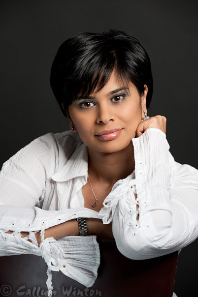
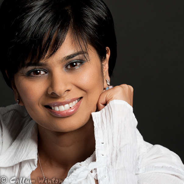
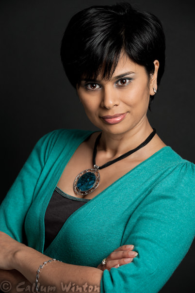
If you were attending a business seminar or looking for a professional service from someone and you see a flyer or promotional email or poster with the following images … which person would you instinctively want to listen to or hire?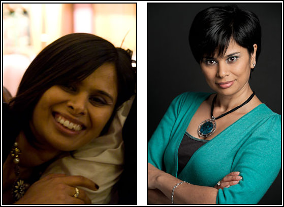
It’s the same girl in both pictures, but we all expect the person conveyed in the image on the right will be the one that will give us the quality service we want. You may think that it’s an extreme example, but it’s not. You’ll be surprised the number of images you see around that are like the one on the left.
But the good news is that it doesn’t actually cost much to get a professional image and therefore you can be 3 steps ahead of your competition.
If money is super tight then you could still book a photographer for a session, but by sharing the session time with a few friends or colleagues you’ll find that it’s much more affordable. The photographer won’t mind sharing and in fact they’ll probably encourage it.
